What is a responsive website and why do you need one?
If you have been looking into getting a website, or if you already have one, you have probably heard about responsive websites. You may also be wondering what they are and if you need one. This article will explain what a responsive website is and why you absolutely need one if you’re maintaining an online presence.
What is a responsive website?
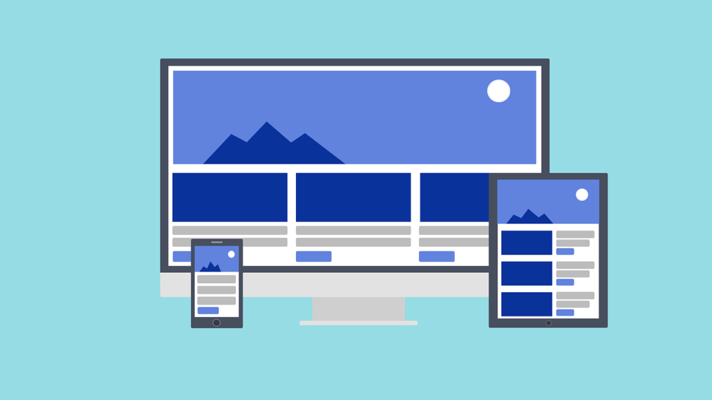
In short, a responsive website is a site that is formatted to be easily viewed on multiple devices with various screen sizes, such as computers, smartphones, and tablets.
As the proliferation of smartphones and tablets has grown over the years, developers needed a way to make sure their websites were viewable on smaller screens. To address the issue, most developers took one of three approaches:
- Make no changes. Developers would leave their site as-is, and viewers had to rely on their phone’s zoom function in order to read the smaller text.
- Create a separate mobile site. This approach required creating 2 or more separate websites (for desktop computers and laptops, tablets, and mobile devices). The mobile site could be sized and developed specifically for viewing on smaller screens. However, this also meant more work since the developer had to create multiple, different-sized websites.
- Create a responsive site. Through the use of cascading style sheets (CSS) developers could have a website reformat on-the-fly so that it displayed elegantly on mobile devices.
Although mobile sites were once popular, the responsive approach is now the more commonly used solution. However, there are still websites and web development tools that do not utilize responsive design. This puts them at a real disadvantage as the world increasingly moves toward using mobile devices for internet access.
Why is a responsive website important?
Nearly half of all websites are now accessed via mobile devices worldwide. This means websites are starting to be viewed more often on smaller screens than large computer ones. I believe these numbers will continue to increase over the coming years as people become more reliant on their mobile devices to access the internet. Needless to say, a website that is not responsively designed has the potential to lose customers, as they are more difficult to view and navigate.
Responsive websites are also designed for speed on mobile platforms. Downloading images and files on smartphones requires bandwidth. Some providers charge their customers extra for excessive bandwidth. So, a responsive site that has optimized image files loads faster on mobile platforms. This allows visitors to access information quickly and without extra expense.
Conclusion
Putting a priority on a mobile-friendly website is no longer a luxury. It is an absolute necessity in today’s world where we frequently access the web on the go. Providing an online presence that is widely accessible and accommodating creates a pleasant customer experience that benefits businesses in the long run.
For more information on responsive design and how it can benefit you, feel free to contact us for a consultation.


