Tips for designing a car magnet
Car magnets can be a very cost-effective method of advertising, especially for small businesses. These small, mobile billboards can be placed on any vehicle and market services everywhere it goes. However, for them to be most impactful, people should avoid these common mistakes when creating a car magnet.
1. Don’t put on too much information
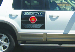
Example of a car magnet with too much text.
One of the most frequent mistakes that people make is putting too much information on it. Car magnets are often seen and read while vehicles are on the move. So unless you are waiting at a red light or parked, people won’t have the time to read your business name, mission statement, services, price list, website, and phone number as you zip along at 35 mph (or faster). When creating car magnets, it is best to keep it simple; your business name, your service, and contact information (for example: Best Fit Gloves – custom gloves for all – www.bestfitgloves.com). These details can normally be read at a glance and provides all of the pertinent information so that people can contact you.
2. The service that you are offering should be clear and visible
When creating signage, of course you want to put your business name out there. But the rules change a little when it comes to car magnets. What is MOST important is the service that you are offering and how people can reach you. Unless the services you offer are included in your business name, just having your business name there may not advertise what you actually do. Even though your business name should be included, it won’t matter if people don’t know what you are offering.
3. Make sure that the lettering is large enough to be read

An excellent example of a car magnet with bold, readable text
The text on car magnets should be large enough to be easily read from a distance. Although a cursive font may look beautiful, is it easy to read as a car is zipping by? If the answer is “no,” then it should be avoided. Bold, sans-serif fonts normally work best and are quite legible even when being viewed from a distance.
4. Use contrasting color combinations
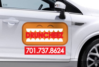
The red text on an orange background is difficult to read.
One major item to also take into consideration is color. Although color can be a great way to draw attention and help your magnet stand out, certain color combinations can be difficult to read. The main issue to consider is the amount of contrast between the colors that you are using. White text on a black background reads well because of the amount of contrast between the colors (light color on a dark background). However, yellow text on a white background has less contrast, and as a result, is much more difficult to read, particularly from a distance. The other thing to consider when choosing colors is the time of day the car magnet will be displayed. Certain colors do not display well at night. So, if you will be driving a lot during the evening hours, you may want to consider utilizing colors that display well in low light as well.
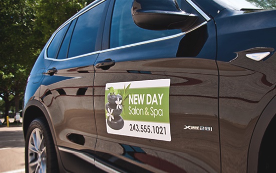
5. Make sure the size of the car magnet is large enough for your vehicle
I know that smaller signs are less expensive. However, it is worth the extra money to make sure that your car magnet is large enough to be seen on your vehicle. If you are driving an SUV, you should opt for a larger sign size than someone that is driving a compact car. Also, the larger the car magnet, the more room you have to make the text as large as possible, allowing it to have more visual impact.
Car magnets are absolutely an inexpensive and effective marketing tool providing you exposure to a large volume of people. By following these tips, you can be sure that your signage is effective and maximize your investment.

